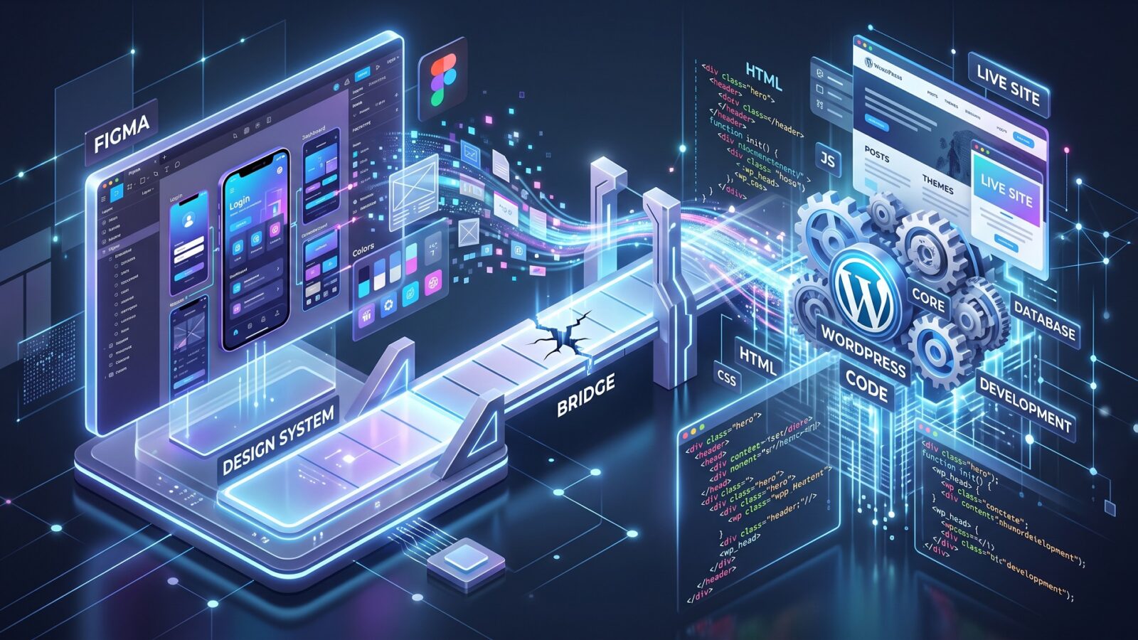
Wordpress
Friday evening. The project manager writes cheerfully: “The client approved the design! The Figma file is perfect — you can start building. It’s all straightforward.”
I open the link, skim the pages, and realise: the first line of code is still a long way off. A layout that looks perfect to the client is often full of technical holes.
As a WordPress developer, I could invent the missing pieces on the fly or ship whatever “kind of works.” That approach always leads to endless revisions and budget overruns. Instead, I pause the process and send the file back to the PM with detailed feedback.
Here are the four most common places where Figma → WordPress handoff breaks — and the questions I ask before I start.
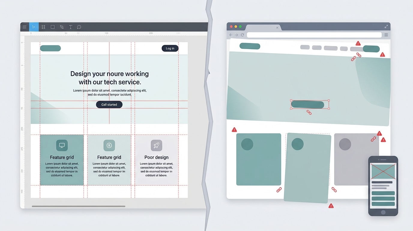
1. Missing states
Designers love drawing the happy path — everything static and ideal. A website, though, is a living system.
What usually gets forgotten:
How does a button look on hover, active, or disabled?
How does an input look when the user enters invalid data (error state)?
What happens to a dropdown when it is open?
How does a form look after submit when validation fails?
What I write to the PM:
“Please ask the designer to add a UI kit with button and form states so I am not inventing colours during build. Otherwise testing will bring surprises that need urgent fixes.”
2. Mobile: “Just stack the blocks”
Responsiveness is not simply shrinking the screen. Most problems sit between desktop (1440px) and mobile (375px) — on tablets (768px–1024px).
Even the mobile version often hides surprises:
Mobile menu (burger). There is a burger icon, but no layout for the open menu. Full screen? Where are the contacts? What is the open animation?
Tables. A huge pricing table on desktop. How should it scroll or transform on a phone? Is there an alternative view (cards instead of rows)?
Sticky header. Does the header stay on scroll on mobile? If yes, does it eat half the screen?
What I write to the PM:
“The file is missing a full mobile version for key blocks. I need at least the main states at 768px and 375px — otherwise I will invent the behaviour myself, and we will both fix it during QA.”
3. Spacing and typography chaos (no system)
Design quality is easy to check by how styles are used. If the file has 15 different body font sizes (14px, 15px, 16px, 17px…) — that is not a design system. That is chaos.
The same applies to spacing. If gaps between identical blocks jump from 23px to 27px, the developer has two options:
Write unique CSS for every block (which bloats the code and slows the site).
Normalise everything to one system (for example 24px) — then the build will not be pixel-perfect against the file.
What I write to the PM:
“There is no shared grid or text style system in the file. I will standardise spacing and type to a 4/8px scale for performance. Please warn the client: visually the difference will be tiny, and the site will be faster and more stable.”
4. Hidden pages and forgotten logic
Clients buy a homepage and service pages — and forget the system screens a WordPress site needs to work properly.
What I look for and often do not find:
404 page. Where does the user land on a broken link?
Thank-you page / popups. What do they see after a successful form submit?
Empty states. How does the blog look with zero posts? Search with no results?
System error screens. What do we show if the server fails or something goes wrong while loading?
What I write to the PM:
“The file has no system pages or empty states. Without them the site will technically run, but QA and post-launch will bring questions from users and from search engines. Let’s commission these layouts now.”
What I send back to the PM after a layout audit
When I say “I am sending the file back,” it is not just “there are problems.” I prepare structured feedback so the PM and client can decide what to keep, what to simplify, and what to move to a later phase.
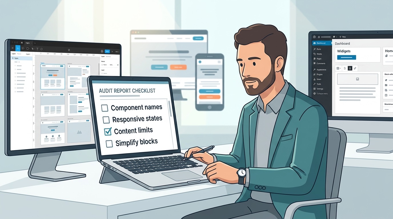
1. A list of risks and bottlenecks
I spell out concrete places where implementation may go off plan:
Blocks that are hard to edit in WordPress without extra tools.
Flows missing responsive or error states.
Elements that need custom logic (non-standard filters, complex calculators).
This is not “design criticism.” It is a risk map so the PM can discuss priorities with the client: where they are ready to pay for complexity, and where simplification is smarter.
2. Simplification ideas that keep the idea intact
Often you can keep the visual intent and make delivery simpler:
Instead of 10 unique sections — 3–4 template blocks with different settings.
Instead of heavy animation — a light micro-interaction that survives content changes.
Instead of a unique grid per page — one spacing and column system.
I show how that affects:
Budget — fewer hours for build and integration.
Maintenance — easier to add new content without a developer.
Stability — less custom code to retest on updates.
3. Clear “easy to edit in WP” vs better left fixed
One of the most important parts of the feedback is the split:
Easy to edit: copy, images, simple blocks (benefits, reviews, case studies, basic service sections).
Better fixed: complex technical blocks, specific integrations, things the client is unlikely to change alone.
That avoids the moment when the client expects “everything works like a page builder,” while half the site still needs a developer.
A real-project example
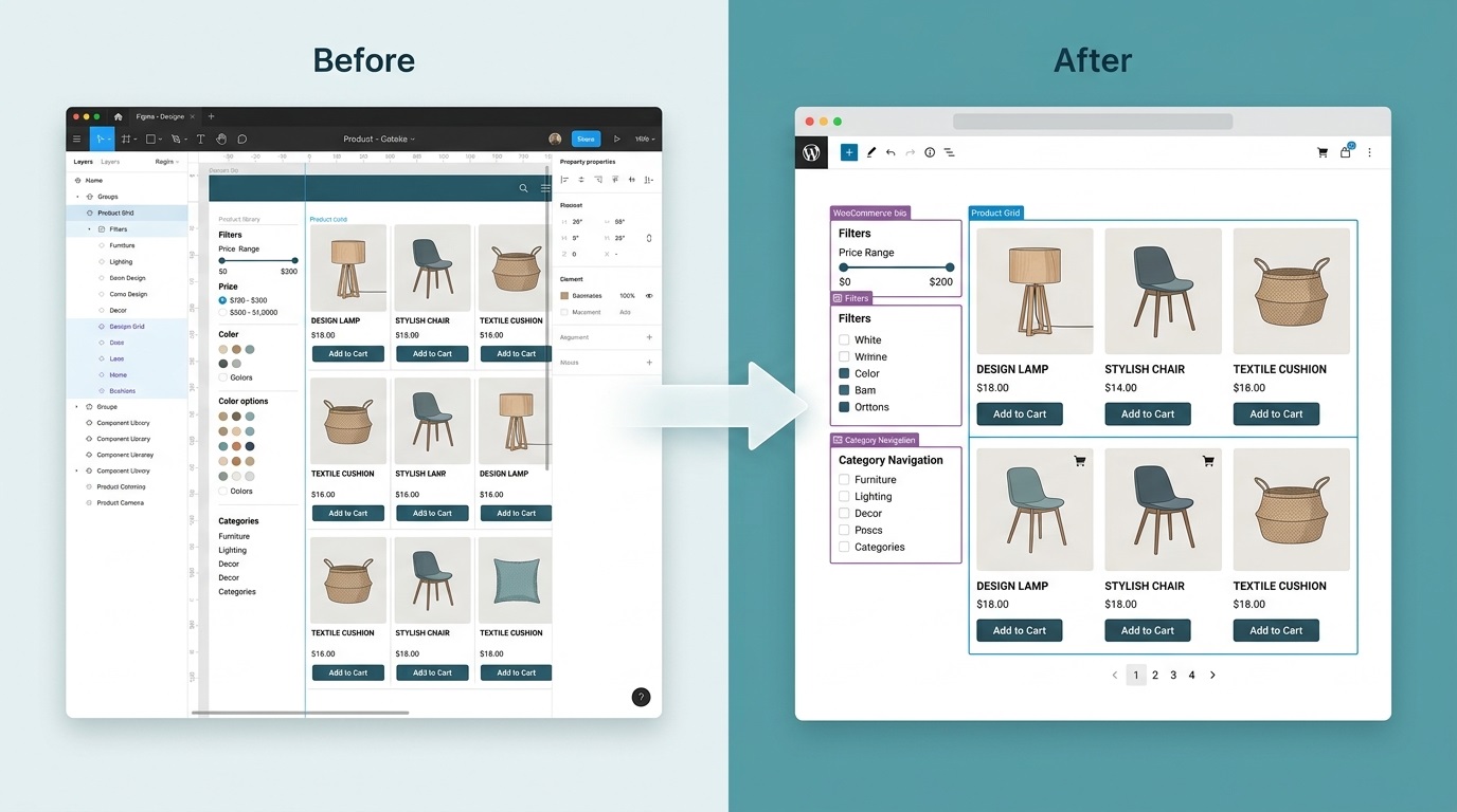
As an illustration — a typical ecommerce/catalog scenario, similar to projects I work on.
What was in the file:
Product cards with perfectly identical titles and descriptions.
Filters shown only in a “filled” state.
A product grid drawn for 8–12 cards, with no “many products / few products” scenarios.
What showed up during implementation:
Real product names were much longer and broke the grid.
Empty filters looked like an “error,” because nobody defined what to show when nothing is selected.
Some catalog blocks were unique per category, when 1–2 templates would have been smarter.
What I proposed:
Unify the product card: one structure, different content, clear limits on title and description length.
Define filter states: empty, “nothing found,” and 1–2 selected parameters.
Instead of 5 unique category templates — 2 main variants (with and without a filter sidebar) covering ~90% of cases.
Result: fewer unique templates, easier maintenance, and the client can add new categories without calling a developer every time.
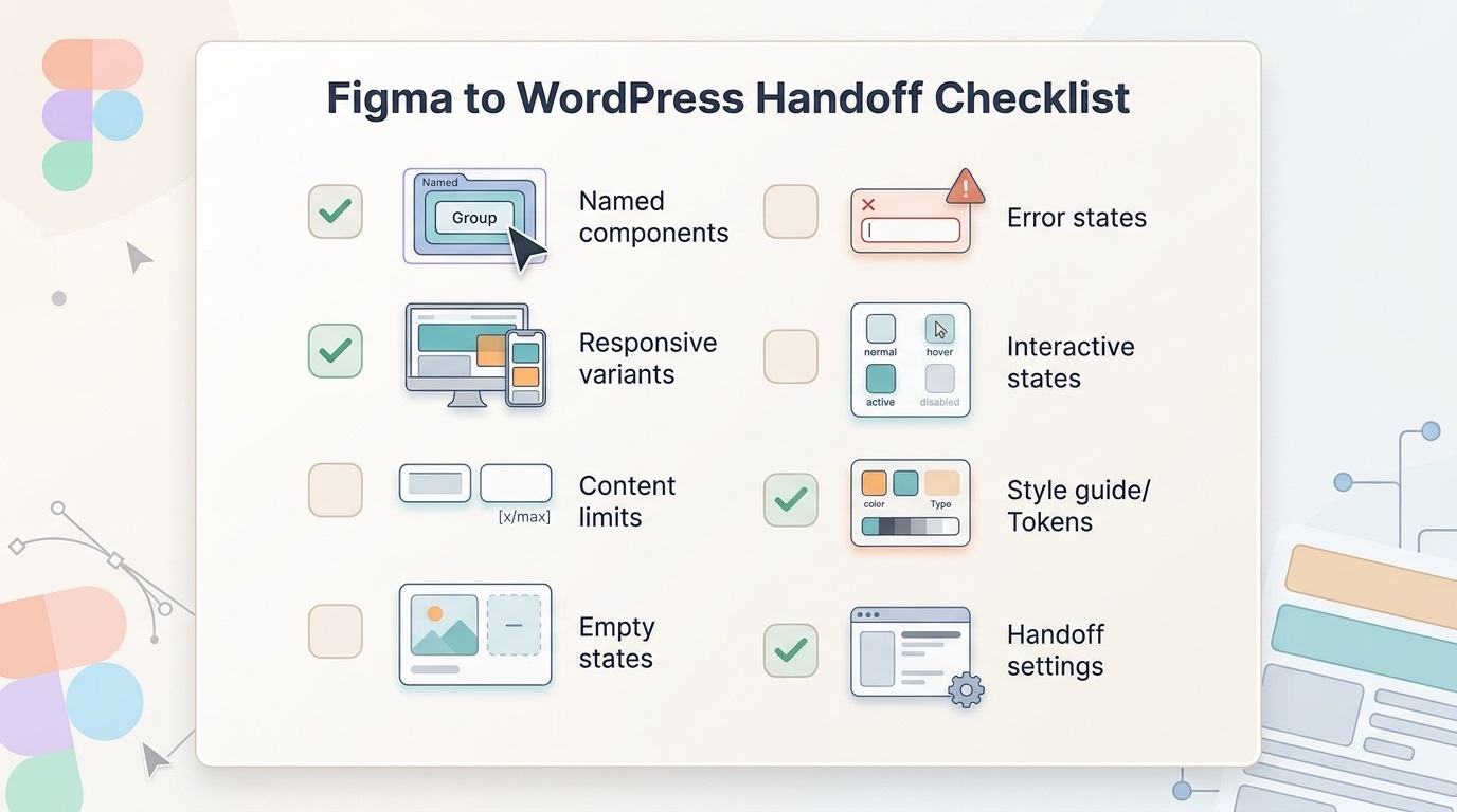
“Figma before handoff” checklist
After the audit I send a short checklist for the designer/PM so the next files are easier to implement.
Components:
All repeating blocks are components/variants.
Component names are clear (“Product Card”, “Service Block”, “FAQ Item”).
Responsive:
Variants for desktop, tablet, and mobile.
Key breakpoints shown (menu, card grids, forms).
Content states:
Long/short headlines, different card counts.
Empty states (no products/services), error states, loading.
Block logic:
Clear which blocks are templates and which are unique.
Limits defined: max text length, item count, image sizes.
That checklist saves time on both sides — fewer “let’s redraw this” rounds.
Why my “no” is care for the project (and the budget)
Sending a file back to the PM with questions can look like delay. In reality it saves dozens of hours at the testing stage.
When implementation breaks because the layouts were incomplete, you always get:
Extra hours agreeing “how this should work.”
Extra front-end iterations, inventing states on the fly.
The risk that part of the work is thrown away when the client sees real content and asks for a redo.
The more questions a developer asks before the build, the fewer bugs and mismatches hit production. I do not work as a blind executor — I work as an engineer who makes sure a marketing site is not only beautiful, but also stable, fast, and easy to maintain.
Ready to turn your design into a fast, reliable site?
If you already have a Figma file, send it over. I will review its technical readiness for a WordPress build free of charge and give you an honest estimate of the scope.
That does not commit you to working together — but it does help you avoid surprise costs and unexpected revisions once development has started.

FAQ
Common questions about WordPress project work and ongoing support.
Is it necessary to have a complete UI-kit with states before starting layout?
Ideally, yes. If there is no UI-kit, I can still start, but then some of the states (hover, active, error) will be invented by me, and surprises may appear during the testing stage. Therefore, it is better to immediately ask the designer to add at least the basic states of buttons and forms - this saves time and edits later.
What if the client doesn't want to make a mobile version of all blocks?
The minimum that should be left: home page, key landing pages/services, forms, catalog (if any). Without this, there will be “surprises” on mobile, which will then have to be urgently corrected. If the budget is limited, it is better to make fewer pages, but complete ones, than all “a little incomplete”.
Are you ready to work with layouts where there are no system pages (404, Thank You, empty states)?
Yes, but I will warn you about the risks right away. Without 404, Thank You Page and empty states, the site will technically work, but during testing and after launch there will be questions from users and search engines. Therefore, I recommend ordering at least the basic versions of these pages right away, even if they are simple.
Does your audit mean the design is “bad”?
No. An audit is not a "good/bad" assessment, but a check of technical readiness for implementation. The design can be visually excellent, but without prescribed states, adaptability, and block logic, it will be expensive and inconvenient to implement. My task is to show where the risks are and how to close them before the start of development.
What kinds of WordPress sites do you work with?
I work with business WordPress sites, WooCommerce stores, and projects that need to grow step by step — without unnecessary complexity or fragile solutions. This includes both new launches and existing sites that need refinements, support, or careful technical updates.
Can you improve an existing site without a full redesign?
Yes. Most tasks involve sites that are already live: new sections, functional improvements, WooCommerce changes, performance optimisation, or technical fixes. The goal is for the site to stay stable, manageable, and easy to develop further.
What types of tasks do you take on most often?
Most often this is custom WordPress development, Figma design implementation, WooCommerce refinements, support for live sites, fixing technical issues, and practical improvements over time. In selected scenarios I also help with light AI automations for content, enquiries, or internal admin workflows.
Do you work on WordPress speed and performance?
Yes. WordPress optimisation usually involves reviewing the theme, plugins, images, fonts, page structure, and the site's overall technical neatness. The aim is not a "magic button", but practical changes that make the site faster and easier to maintain.
Do you use AI when working on WordPress sites?
Yes, but only where it genuinely helps the process. AI works best for content drafts, FAQ or support assistants, enquiry handling, and small automations around an existing WordPress site. The approach is simple: AI should reduce routine work, not complicate the site.
What do I need to prepare to discuss a task or project?
Usually a short description of the site, the task, the desired outcome, and examples or technical constraints if you have them is enough. If the project is already live, it also helps to share the current site or a staging environment — this makes it easier to understand the scope of work.
Can I get in touch not for a new site, but for support or specific improvements?
Yes. I work not only on new builds, but also on live sites that need to be maintained, fixed, and improved gradually. This can include new pages, admin changes, WooCommerce refinements, small UX improvements, or technical maintenance.
Need help with a WordPress project?
If you need custom WordPress development, design implementation, or support for an existing site, I would be happy to review the project.